I love Jane Davenport's book entitled Beautiful Faces. It didn't disappoint.
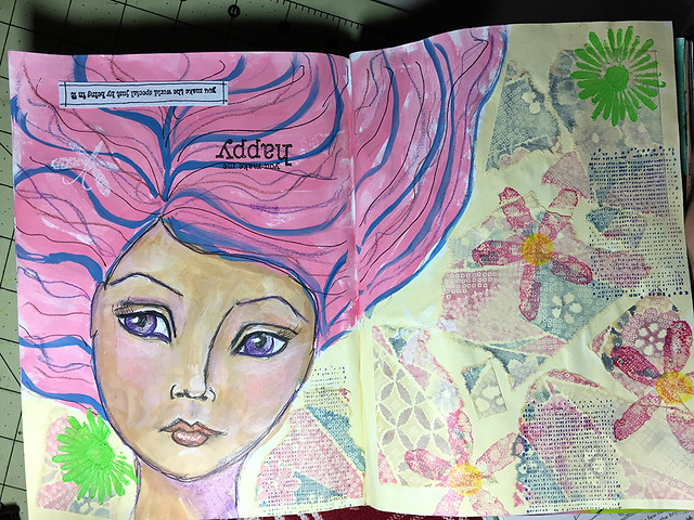
I decided to do my first attempt at a "beautiful face" upside down in my art journal book because (1) one of Jane's samples in the book was upside down and I thought that it was cool, and (2) I was pretty sure that it would be a failure, and I figured that if it was upside down you couldn't tell right away how bad it was.
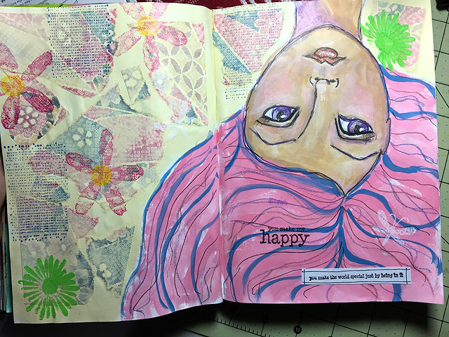
I'm happy with how the sketch came out, but am stymied with the color blending of the skin tone. Not sure if it's the type of paint that I used (2/$4 at Ben Franklin) or my technique. Or maybe I should water down the paint . . . or . . . hmmmm . . .
I used origami paper from Honolulu Aunty for the background, painted over with one of the paints that I used for the girl's face. Thanks again, Aunty!


10 comments:
so so pretty!
Honestly, I see no flaws. Beautiful face. I like expressive eyes.
Beautiful!!!
sooo neat!! I like how you're using your stamps too...no go to waste!!
Thanks Kat!
Chet, when I used to take a lot of portrait photos, I would focus on the eyes. I loved how they are so reflective.
Thanks Aunty! Your paper is coming in so handy!
Les, I looooove using the stamps!
Her eyes...wow! It's perfect! I spy a stamp set I have : )
So pretty! I love the colors that you used.
Izsmom
Susan, that's a cool set, yah! I love that I'm getting to use some of my stamps!
Thanks Izsmom!
I like this drawing and colors are amazing.
Thank you, Mmiissee!
Post a Comment